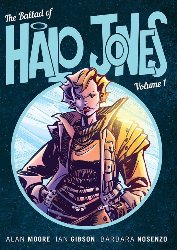
© 2019 G.N. Jacobs
The Hoop, a habitat ring more or less near modern Manhattan apparently placed between the high and low tide marks in New York Harbor. An enclosed society, much like a space station, struggling to provide basic services. Riots and other types of sturm und drang are daily occurrences likely to make shopping for groceries an adventure. Into this maelstrom we hurl 18-year-old Halo Jones depicted going to the store with friends depicting her last 36 hours in the Hoop.
A lot of bold emphatics…
Writer Alan Moore and artist Ian Gibson thus propel the reader into a dystopian far future adventure driven by an everywoman, just getting by luck to still have skin on her fingers. Created in the middle-80s with The Watchmen and V For Vendetta still ahead for Mr. Moore, we see in this day-in-the-life story the beginnings of why the average comic book fan gets a weird look when the nerd fight at the register turns to Alan Moore. Though I do try to keep my scorn, derision and slight regard at how the lack of an independent editor allowed the even more recent Promethea to go so completely off the rails out of the discussion.
The management of this blog apologizes for this unwarranted attack upon the review of The Ballad of Halo Jones Volume One – SPLAT! – by the currently imaginary review of Promethea. Steps were taken behind my back and retroactively approved.
Moore and Gibson cleverly use Halo’s last day and a half in the Hoop, divided between catching a friend’s concert and an epic shopping expedition, to give us a tour of dystopia rendered on the half shell. Riots are common. High tides that force closure of ring sections to prevent flex damage happen twice a day. And don’t get Halo started on the spotty and inconsistent public transport. All of the above must be taken into account just going to the store, an expedition that might have given Leif Erickson cause to hand over the horned Viking helmet.
In the hands of any other creative team the narrative in this volume would be truncated into five minutes of backstory highlights while telling us the story of the next volume. Quickly show us the tragic murder of Brinna, Halo’s nebulously defined maternal figure. Quickly show us Halo parting at the ramp to the antique space liner, Clara Pansy, promising to meet her friend, Rodice, on the nearest off-world port before boarding with Toby, the Robo-Dog. Can you say Casablanca?
Moore and Gibson bend considerable skill towards turning backstory into story. Simply by making shopping seem like the reader’s choice of setting sail for the New World or sacking Lindesflarne, the first time. And making sure that Rodice, born and bred in the Hoop, is as agoraphobic as they come.
It’s Halo’s nature as the everywoman who spends more time getting beat up in riots between panels and running away from all other trouble that makes this story. A Class Five astronavigatrix like Barbarella pretty much vaporizes whole swaths of Hoop society and then gets laid. Ooh! The crossover fan fiction, oh never mind…these ladies don’t belong in the same quadrant let alone a shared story.
Initially created for British publisher 2000AD’s model of weekly anthologies that only needed five pages at a time from each story presented, the story builds like a TV season or newspaper strip. As part of the build it takes a few installments for Halo to come out from Rodice’s fairly large shadow as the protagonist with her name on the marquee. It’s purely a matter of taste to argue if this process happens soon enough for the reader, I thought “move it up a couple sections.” But, this is just a feeling based on theory that doesn’t really affect the read.
Certainly, Halo cements her status when she makes use of Rodice’s dropping a zenade (zen grenade) trying to avoid going outside. After that it’s the Halo show. Will she survive long enough to sign aboard the Clara Pandy?
Moore and Gibson working together created this world. Complete with a slang and speech patterns that feel like the best possible guess as to what English may sound like in the far future of about five thousand years. Taken with a caveat, this dialogue feels natural to the character and story.
The caveat leads me to the single most glaring peeve reading this volume, the lettering. As in I joked to the friend that suggested the Halo Jones series to me, that I wanted to borrow his real cardboard tube (a mighty weapon of renown) and his imaginary time machine (a long-standing in-joke) to go back to make my displeasure felt through the decades.
Possibly, it’s the pad size in the reprinted collection I read. Perhaps the size of the lettering relative to the image size was always a trick by the publisher to weed out reviewers with middle aged eyes in desperate need of a magnifying lens. Luckily my similar complaints about Barbarella, started before and completed after, have already caused me to bite the bullet and buy a lens. NYAH-NYAH!
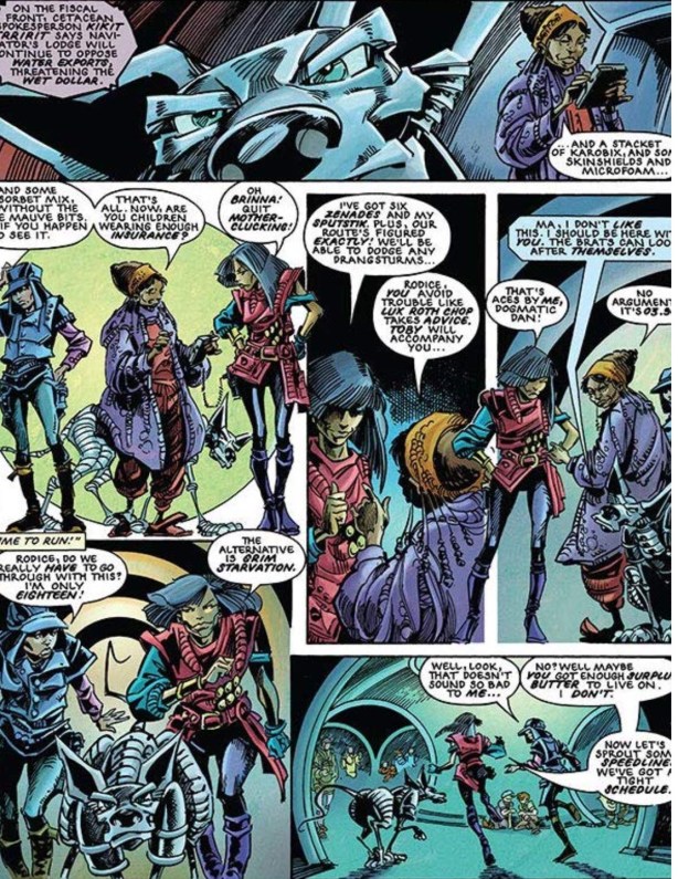
Anyway, there are three classes of text all of which annoyed me to one degree or another. The regular non-bold prose lettering came in slightly small but still readable to my naked eye. There are a few passages of Halo starting a journal while trapped in the Hoop’s subway on the way home, rendered in a really tiny font in pink caption boxes. Less eye friendly, but still barely acceptable. And lastly, we have the profusion of bold emphatic words…ironically the real reason to use a lens.
I mentioned liking the slang and dialogue in this book…with a caveat. Most of the new words in this story are rendered as a bold emphatic (italics in Roman and similar fonts, underlined in typewritten fonts like Courier and bold in hand lettered comic books). But, the letterer earns most of my condemnation for how bold words were handled: blobby, mushy and next to impossible to read without a lens (see representative picture above).
I do get to land much of my hating the lettering back in Mr. Moore’s lap as the writer. Bold text in a comic book functions like the many other ways in other media to represent emphasis for irony, sarcasm, and any strong emotion where an All Caps shout isn’t appropriate. Fortunately comics books have other ways to depict thought and telepathy. Emphatics have a way of tricking the reader into applying mental stress sounds to the words on the page, so with this many bolds on the page I’m sure I’m imagining Halo’s speech patterns all wrong.
What is on the page in the average speech balloon, tricked me into reading these words with way too much emphasis and a crap not well thought out singsong that doesn’t even sound to me like English, even future English. I likened the read to experiencing an alley rumble between iambic pentameter and trochaic tetrameter without the benefit of a skilled fight coordinator to make things blend well. Speaking of alley rumbles, cue the angry tomcats.
And I get to level this criticism at Mr. Moore over this because, I can tell you that every italic or underline in any of my own scripts and manuscripts I did as an intentional act. This means that while the letterer might have been horrible, he/she/they went from Mr. Moore’s script. So my caveat for enjoying Halo’s slang and other dialogue is the reader might want to do the internal mental gymnastics to remove the bold letters and let her say the words with a normal tone of voice.
Moving on, Mr. Gibson as the artist and co-creator really helps the story. It’s a true art form to tell stories in sequential art and wow! I may have bought my magnifying lens for that other space heroine’s comic book and used it here. The difference between the reads is that here I didn’t need the lens for anything related to the art and Barbarella has both tiny lettering and small harder to see panels.
At no time with Mr. Gibson’s work did I ever lose track of Halo, Toby or Rodice. At no time did I go back to look at a previous panel to make sure I grokked. I remained fully within the dark clammy and terrifying world of the Hoop, where Halo seems the seconds away from the next mugging. And I suppose I lack the vocabulary to keep going on.
As awesome as I think Mr. Gibson’s pencils and inks were in the original black and white comics, we must acknowledge the coloring done long after the fact by Barbara Nosenzo. And now we’re cooking with gas. She imbues the already dark world of the Hoop with variations of dark greens, blues, murky grays highlighted by highly intentional uses of brighter colors in better lighting. Yeah, I’ll be checking out her other work.
To recap about The Ballad of Halo Jones Volume One, I see why people like and/or love the book. A great character to act as counterpoint to Barbarella at one end and Sarah Connor at the other. A well-plotted narrative that raises shopping to the level of a Viking raid on Sussex or even Newfoundland. I love the art and the later coloring. Ah, if we just could’ve fit an anti-bark shock collar to Alan Moore during the writing and hired anyone else to letter, the differences between a merely great comic book and the kind of book that…

Excellent! Well done. Here’s my own piece on Halo… https://chrishallamworldview.wordpress.com/2014/07/16/thirty-years-of-the-ballad-of-halo-jones/